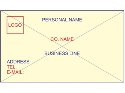
Visiting card is the backbone of business. You are recognized by your identity and Visiting Card is the medium which discloses your identity. Visiting cards may be designed in thousand of ways but the best Card is that which fulfil your purpose. For this, it should be designed as per Vastu. Following are some points to be kept in mind while designing a Visiting Card:-
- The size of card should be normal i.e. not too big and not too small.
- The card should be one which may be destroyed.
- Color of the card should be cream or white.
- Name should be in upper left corner.
- Contact number should be in upper right corner.
- Company name should be in bottom center.
- Address should be in bottom right corner.
- Center of the card should be kept blank.
- Color for names should be blue, green or black.
- Color for contact details may be red or grey.
- Address should be given in deep yellow, blue, orange colors.


